Create unified support and self-service experience
Summary:
Initiated project as important touchpoint in customer journey, identified and brought stakeholders together, interviewed customers and employees, tested, initiated analytics into process, optimized for top tasks. Build first mobile search experience.
Challenges:
- building trust in UX with siloed department overseas
- Support team in Bulgaria did not want to rename their site, Sphere, to Support. However, customers indicated that this was confusing, as it seemed like another product name. ,
- content from acquisitions had never been handled,
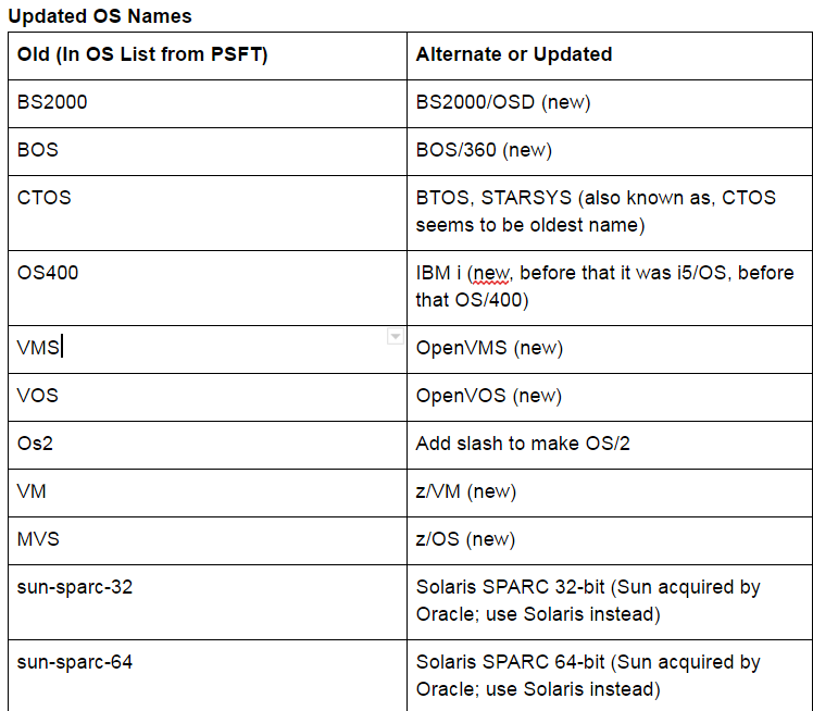
- operating systems filters had outdated names,
- category names were not data-driven and had never been tested,
- site was not responsive,
- there were pages of filters, most of which only needed to be set once,
Process & methodologies:
- customer interviews
- support engineer interviews for top customer pain points
- initiated customer and support engineer collaborative design
- update operating system filter names
- group related documents into new categories
- remove unused and group rarely used filters
- flowcharting
- usability testing,
- prototyping,
- initiated analytics into process
- Agile methodology
Tools:
- Card-sorting,
- pencil/paper,
- Axure,
- Google Analytics,
- support site search logs,
- wrote C++ program for cluster analysis
Understand user self-service tasks
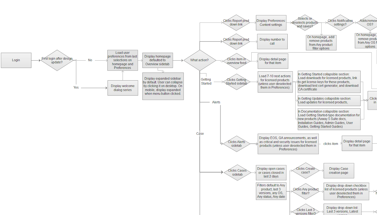
I created task flows to break down the complexity of the current support site to create a more unified experience.
Iterative design - older concept
Final design
From the sidebar, users can easily:
- manage their notifications and understand which notifications they need to attend to first,
- access new content,
- find information on training and events
- manage their cases so that they always know what status open cases are in
- search across all categories or within a particular one.
- add additional filters
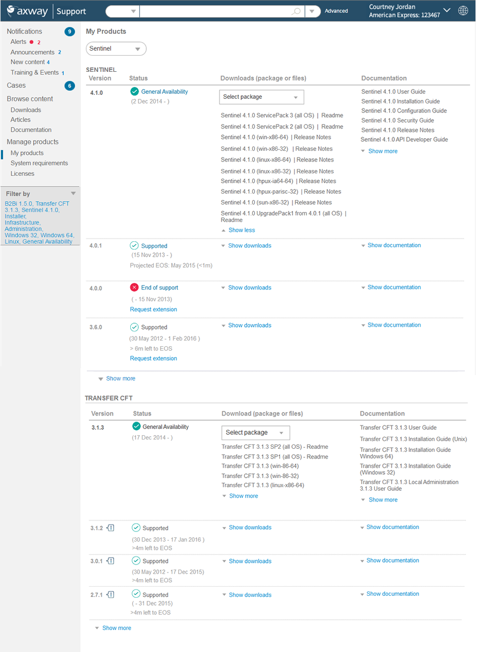
In the My Products page, users can manage their products, download updates, and access documentation. Clicking the filters will expand the filters sidebar. I also looked at having the sidebar be two tabs, but this got more complicated considering that it had to work on mobile as well.
Documentation
In the Documentation area, users can access documentation for each of their products, see how recently they were updated, and favorite docs.
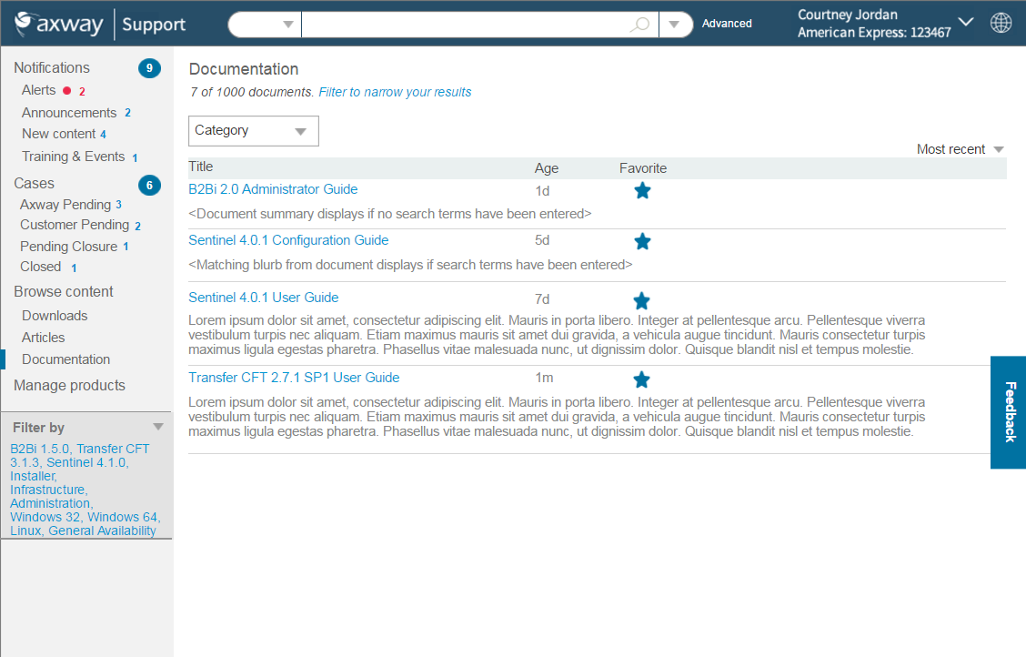
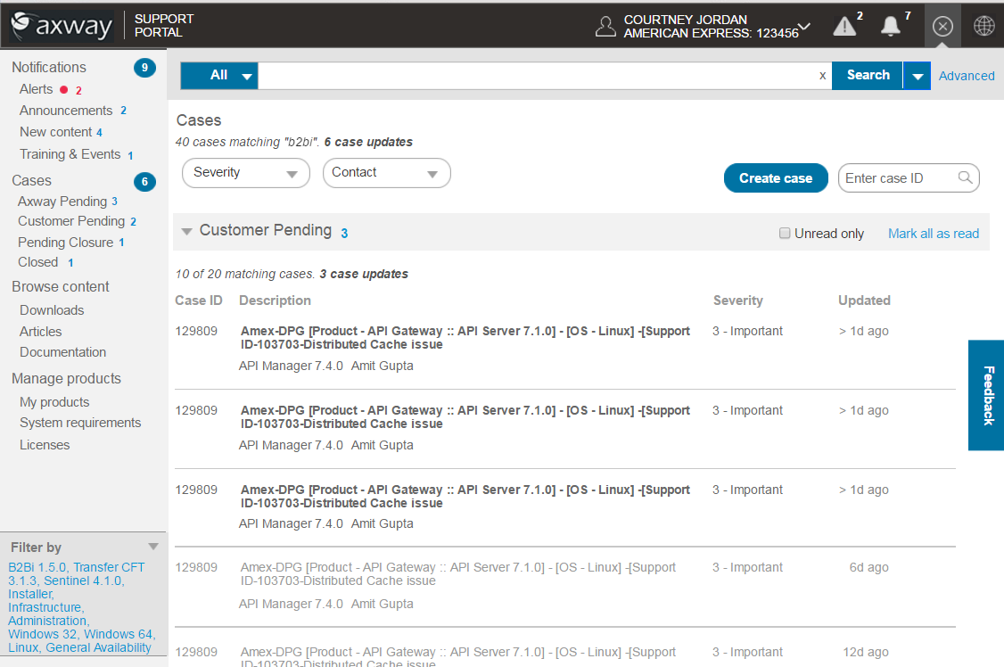
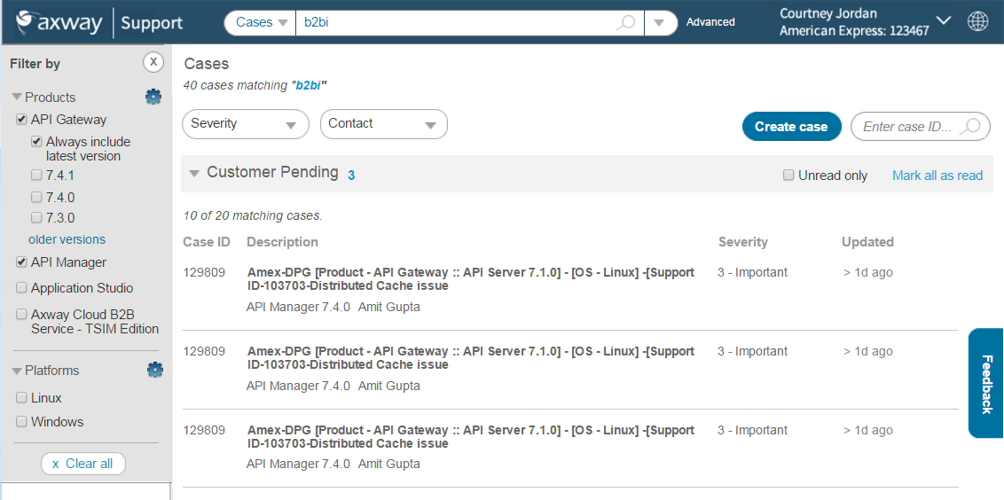
Cases
In the Cases area, users can filter cases by particular products, severity, and support agent. They can see each case's severity and when it was last updated. They can also view only unread updates or can mark all as read. An improvement to this would be bringing forth a summary of each update.
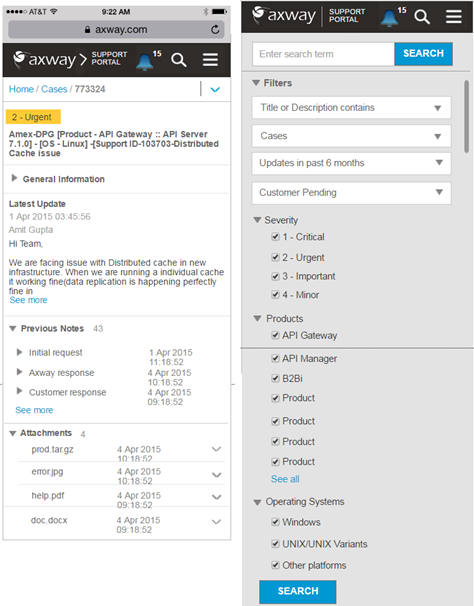
Enable mobile self-service
This was the first mobile anything for Axway. It aligned with users' goals because when someone is trying to fix a problem, they are generally on their mobile phones and expect to be able to search for it, as well as to get notifications such as case updates while they are on-the-go.
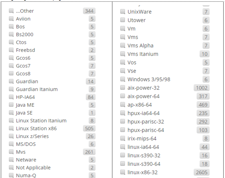
Clean up filters
There were pages of outdated and even unused OS filters. I researched the new names for all of the OSs, went through all content and identified which to remove and what the updated OS names should be. This aligned with users' mental model when trying to find product documentation pertaining to a particular OS.
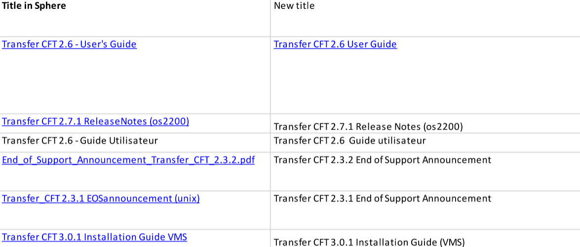
Group related documentation - there were many acquisitions where this had never been handled and three main languages
Group related documentation
There were many acquisitions where this had never been handled