Account activation and recovery: Sign up, sign in, forgot password
Ensuring that users can easily sign up, sign in, and recover access to their account is critical to maintaining their momentum and building their trust. This is the user's first interaction with your product.
Objective
- Provide seamless sign up, sign in and account recovery.
- Decrease time-on-task, maintain new user momentum, and avoid wasting existing users' time.
Challenges
- As a tech startup, a whole platform needed to be built, so had to gain support and buy-in to optimize these table stakes processes.
- Account activation emails did not look trustworthy - they had no branding, did not follow best practices to alleviate uncertainty and assuage security concerns
- Account activation and recovery emails were not sent in a timely manner, thus new users lost momentum and existing users wasted time and lost trust
Original design
The old design (which I unfortunately don't have an image of) had many issues:
- The integration platform had a different logo from the company itself. This made for a confusing experience.
- Instead of using the right side of the sign in for something engaging, such as showing what you could do with the platform or getting you excited about new events or upcoming features, this valuable real estate was taken up with a bright blue background with a random geometric design.
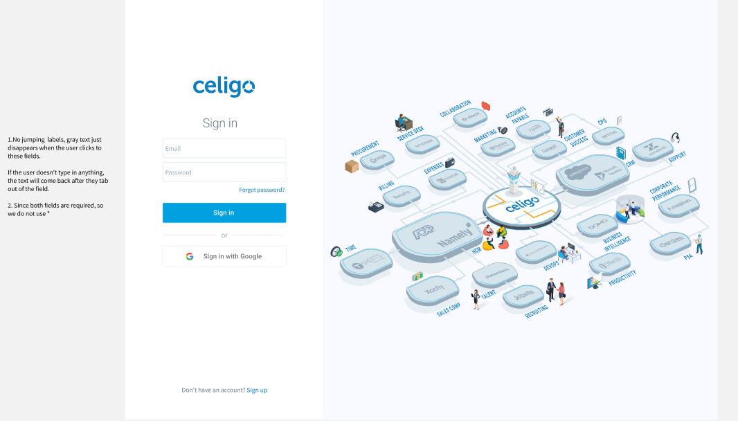
- There was no eye icon to reduce errors when people were entering or creating their passwords.
- There was no Sign up link on the Sign in page, for people who navigated to the page
- Field labels outside of the field actually jumped when the user attempted to enter information in fields.
- Although users could link their Google accounts from their profile page, there was no Google SSO (single sign-on) button on the Sign in page ,so this was not discoverable and not intuitive.
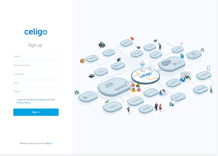
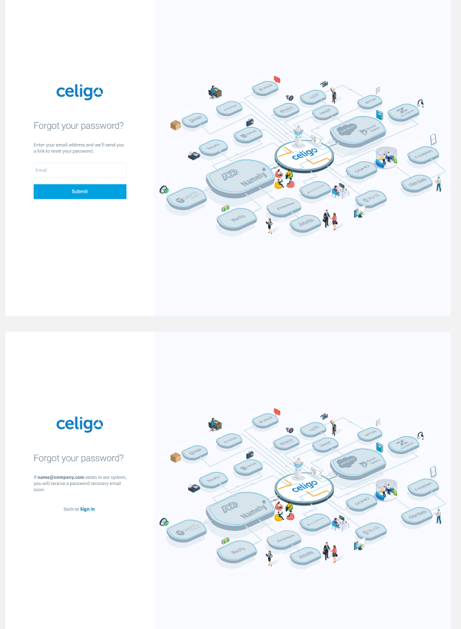
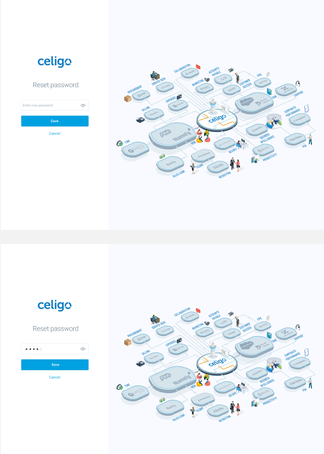
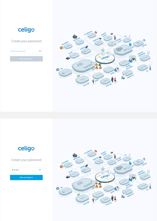
Modern, trustworthy design for a startup that was movin' on up!
The new Sign up and Sign in process resolved the above issues:
- Used the company logo to eliminate uncertainty and promote brand awareness.
- Put something more engaging in the right side, starting with a marketecture diagram, but over the years, eventually becoming an area to let users know of cool new features and events.
- Added an eye icon to eliminate password entry errors.
- Immediate delivery of account activation and recovery emails (such as reset password)
- Emails had clear branding, a clear CTA (call-to-action button), and aligned with security best practices to eliminate uncertainty and assuage security concerns.
- Sign in with Google button to enable faster access.
- Guidance to ensure user entered password that met security criteria (not shown below).
- In-field labels
- Remaining issue: There was still an issue of accessibility: background/foreground contrast.
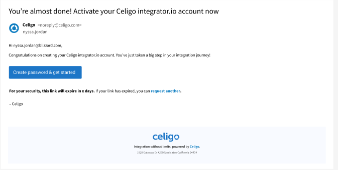
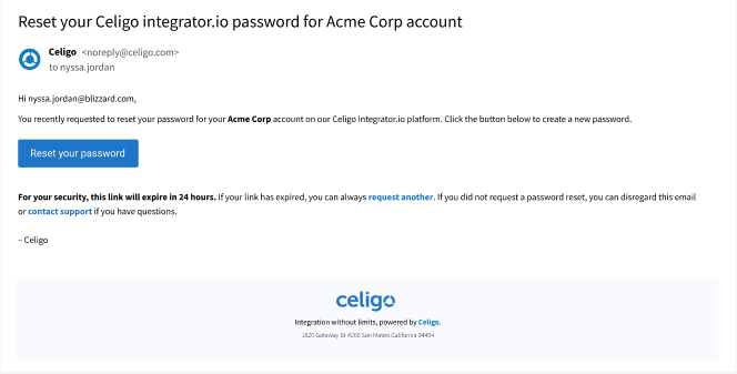
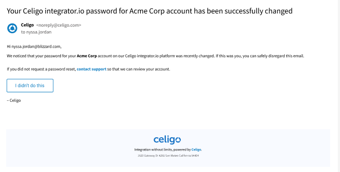
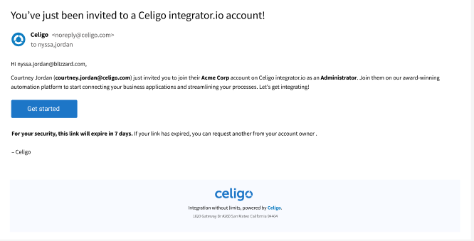
Account acivation and recovery emails
Original email
The original email did not align with security or UX best practices, with long links, no branding, no CTA button, and no way to assuage security concerns. It also linked the product name erroneously to an anonymous sign in page instead of to one where the user was activating their account, creating a confusing user experience, as the user then had to click Forgot password, even though they hadn't set up a password yet.
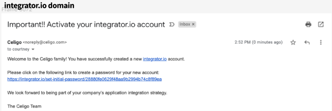
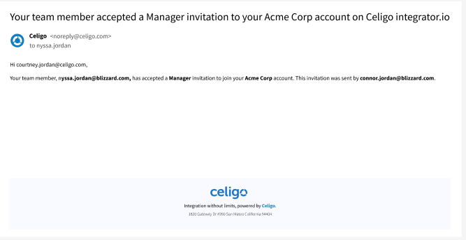
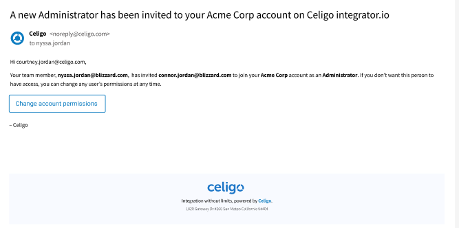
New email design
The new email provides primary and secondary CTA buttons, no long links, branding, and aligns with security best practices.