Creating a design system from scratch
I was the founding member of the UX team at a tech startup, thus created all designs and documented them. As the team got bigger, this design system helped us to be more agile and deliver more quickly.
Summary
- Create design system as quickly as possible as I was also designing the entire platform. Design system is based on Material Design.
Design principles
Just enough research and Just enough design are guiding principles:
- Bring data forward: Make sure that users have the information they need when they need it. This encompasses not only UI text, but also error messages providing the information users need to resolve errors
- Good enough design: We need to get features and enhancements out quickly. Timebox designs and try not to revisit too many decisions. We can always iterate as we get more info.
- Ensure user always knows current status after performing actions
- Reduce cognitive burden: Don’t make them think! Even developers like using a tool that is fun, engaging, and intuitive. Automate the things we can, make simple the things we can’t.
- Collaboration: We need everyone’s insights and experience to make a great experience. Internal and external stakeholders welcome!
- Communicate system status: Don’t leave the user hanging or leave them with questions. Make sure people know what is happening in the system at all times, whether an action was successful or not.
- Connectedness: Provide a holistic, connected experience, from onboarding and engagement through support.
- Consistency: In helping people understand the mental model of our product, consistency of element placement, system behavior and interactions.
- Other design principles: Users spend most of their time on other sites. This means they prefer your site to work the same way as all the other sites they already know. Simplify the learning process by providing familiar design patterns.
- Consistent iconography and clear visual language
- Intuitive information architecture and navigation. Users should always know where they are and how to get back.
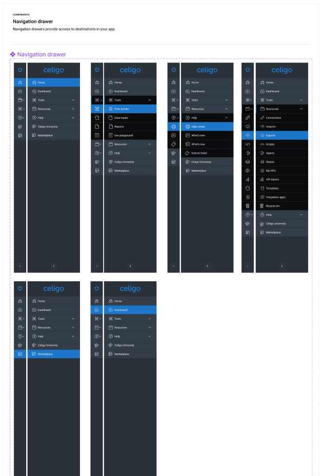
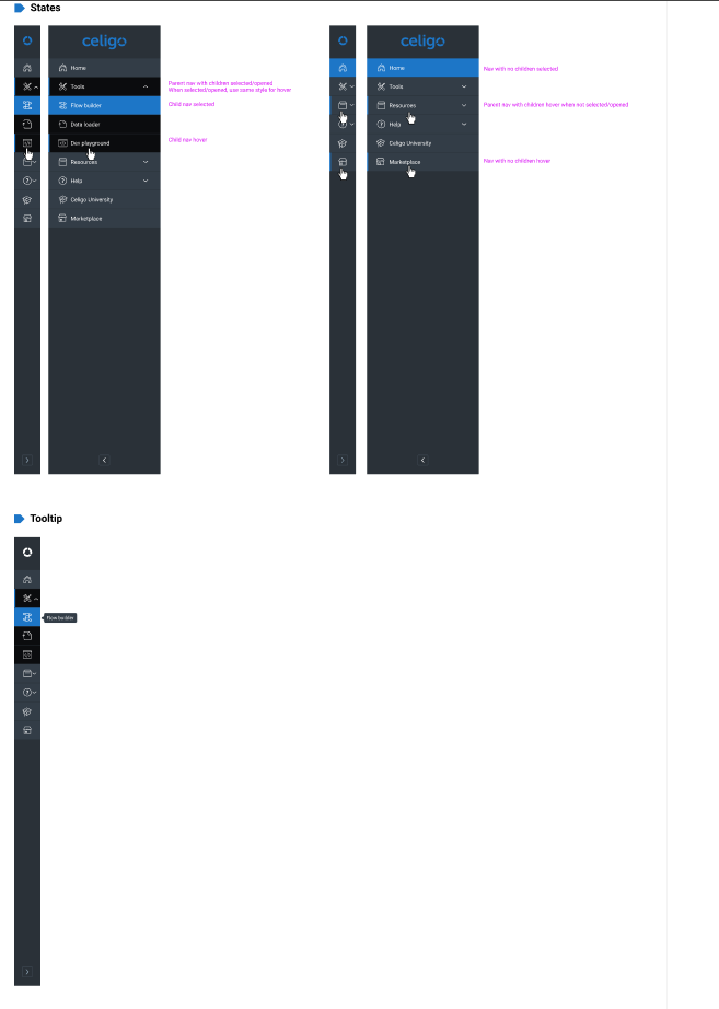
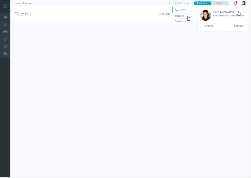
Clear navigation so users always know where they are
- Sidebar with expandable sections
- Breadcrumbs trail
- Top navigation bar for switching accounts, environments
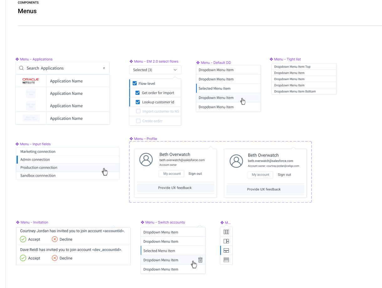
Menus
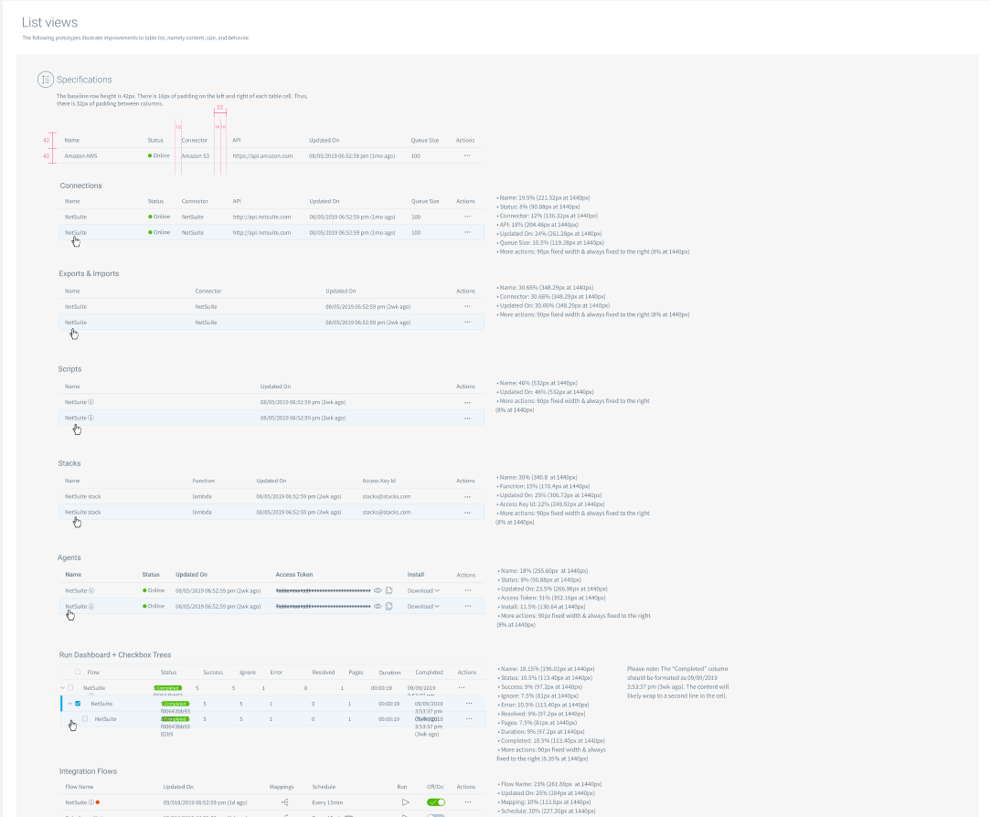
Lists
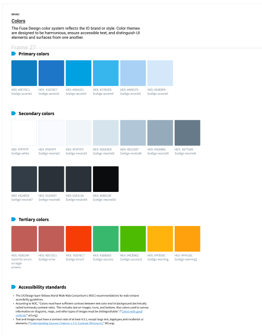
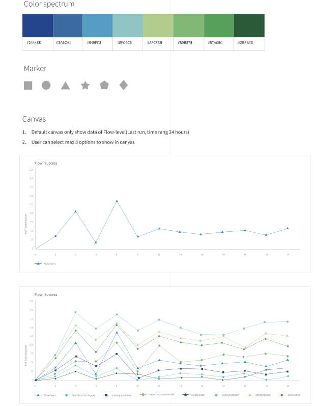
Colors
Line graphs
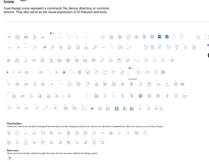
Iconography
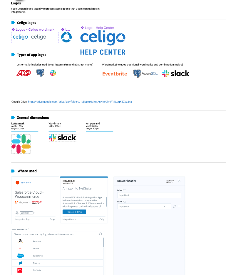
Logos
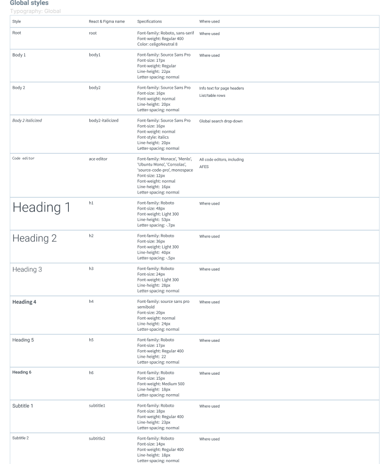
Headings
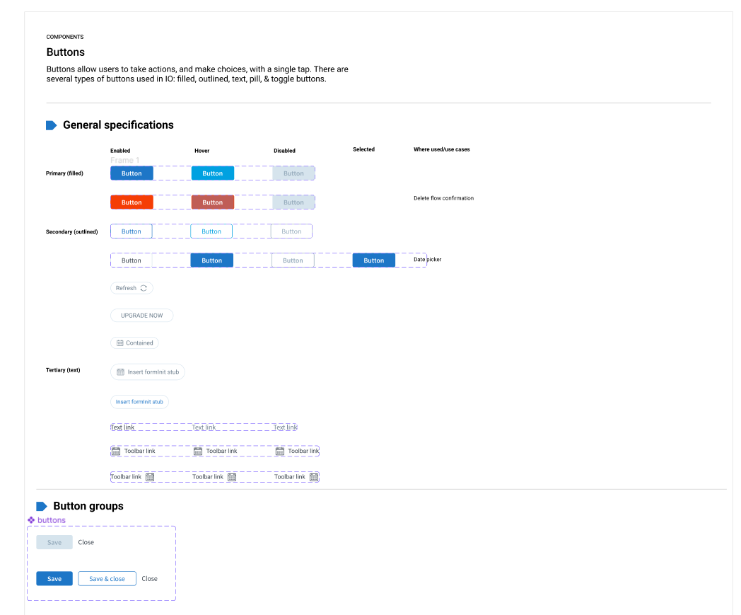
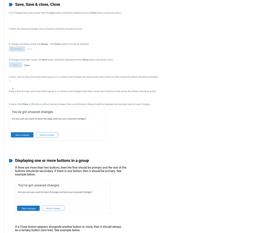
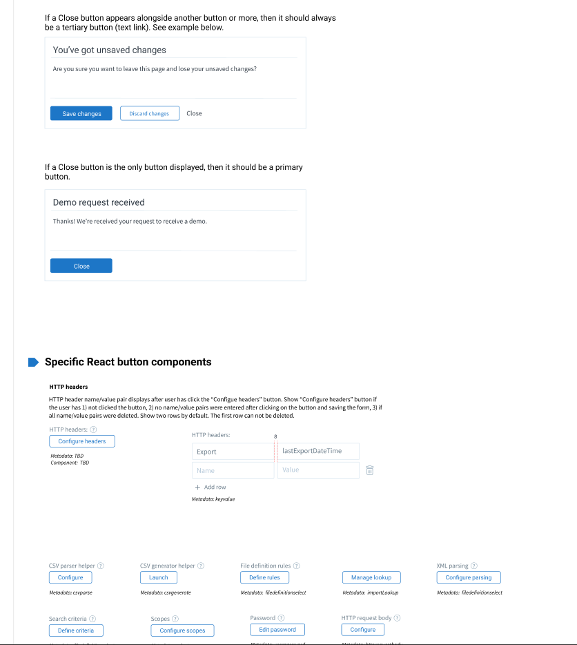
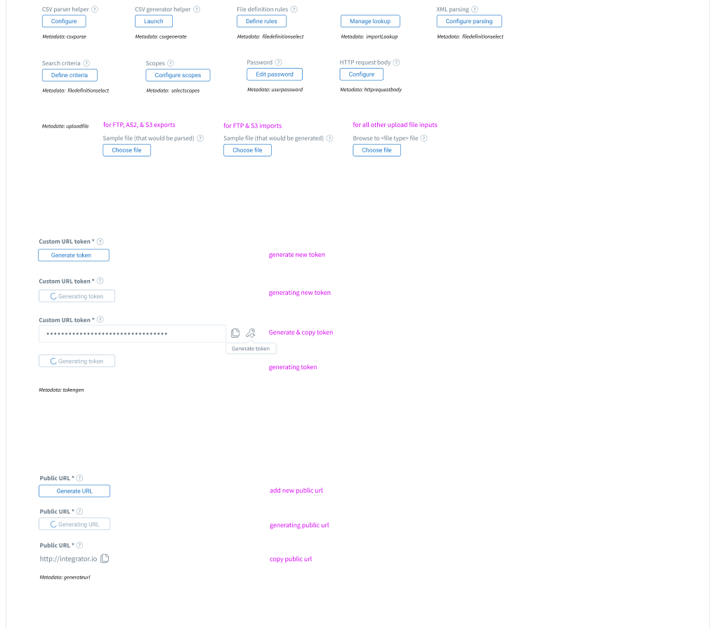
Buttons
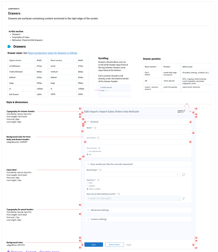
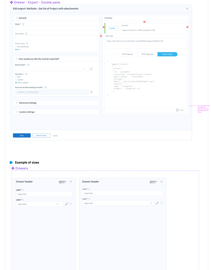
Drawers (Panels)