Redesign B2B analytics application for accessibility and Axway platform integration
Business problem:
Axway had attempted to update its client-based monitoring application by licensing a web-based application, but that application was rife with usability issues, had a high cognitive burden, high time-on-task, slow performance, and was not in the least accessible.
Summary: Initiated information re-architecture, reviewed and iterated with stakeholders, interviewed and collaboratively designed with customers, tested, identified top tasks and optimized navigation. Helped plan roadmap. When I showed all the architecture issues, functionality and accessibility issues, and how-to videos, it changed company strategic direction for analytics to another product.
Challenges:
- licensed product had many usability and accessibility issues
- information architecture was not intuitive,
Process & methodologies:
- information architecture,
- interviewed customers,
- created how-to videos,
- performed functionality and accessibility testing,
- created VPAT (Voluntary Product Accessibility Template),
- initiated customer collaborative design program,
- usability testing,
- designed color-blind safe palettes,
- redesigned stand-alone product to fit new branding,
- redesigned integrated product for product suite,
- iterative prototyping
Tools: Visio, video conferencing/Google Docs (for tests and surveys), Axure, JAWS (accessibility testing)
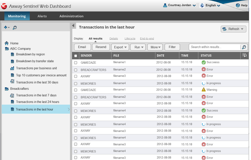
Original design
The product was a long way from where we needed it to be, both from the design and underlying architecture perspective
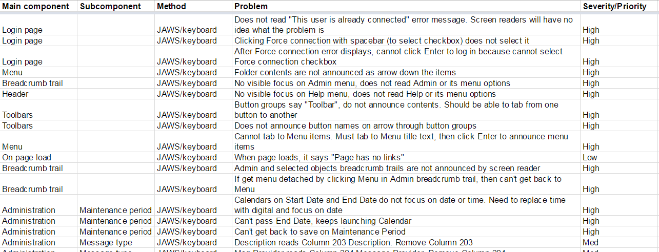
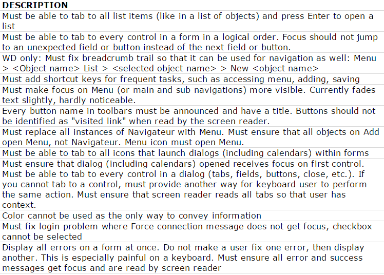
Accessibility testing
There were over 300 accessibility issues in 51 categories.
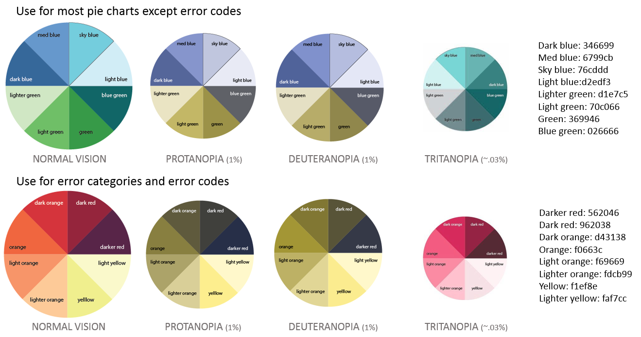
Analyzing color-blind experience
There were many issues - you couldn't set the order of colors, the chart design was difficult to read even for normal vision users, and the legends were too small and too far away.
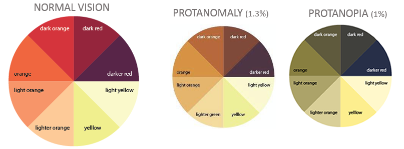
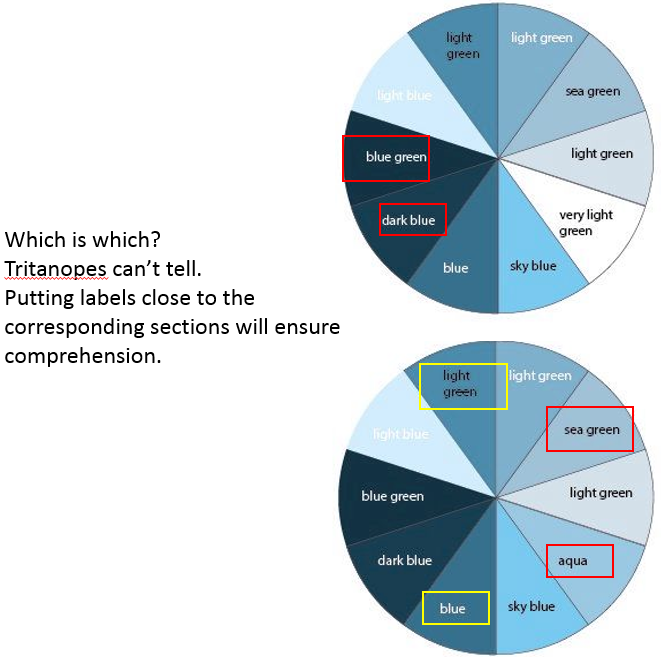
Designing color-blind safe palettes
I created palettes that would work for Protonopia, Deuteronopia, and Tritanopia. This covered both red-green and blue color blindness.
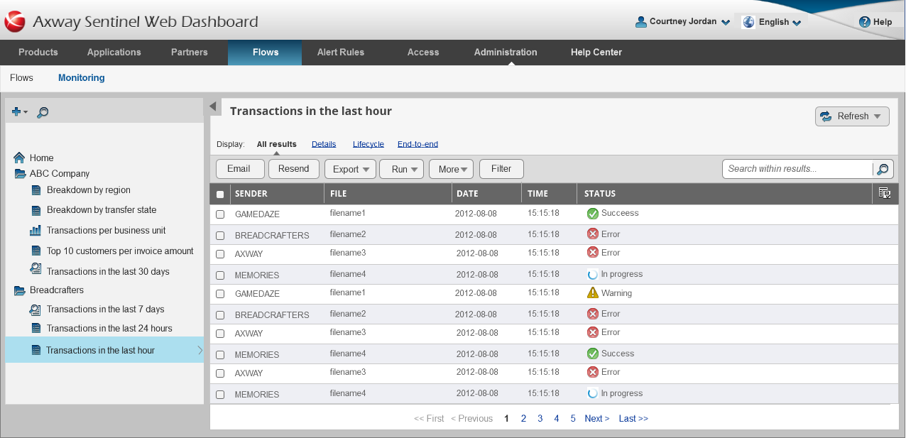
Final design
The product could either be stand-alone or integrated as part of a data governance suite.
Summary:
Initiated information re-architecture, reviewed and iterated with stakeholders, interviewed and collaboratively designed with customers, tested, identified top tasks and optimized navigation.
Challenges:
- difficult to change architecture with legacy code,
- huge feature backlog made it hard to get UX improvements implemented,
- needed to build team's trust in UX
Process & methodologies:
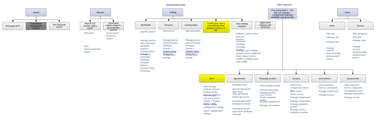
- created information architecture (moved whole pages to reduce dev impact)
- initiated customer collaborative design program
- identified all related tasks for each module
- created sidebar which doubled as side nav or search, depending on page,
- performed usability testing with customers and employees,
- iterative prototyping
Tools: Visio, video conferencing/Google Docs (for tests and surveys), Axure, support site search logs, code editor
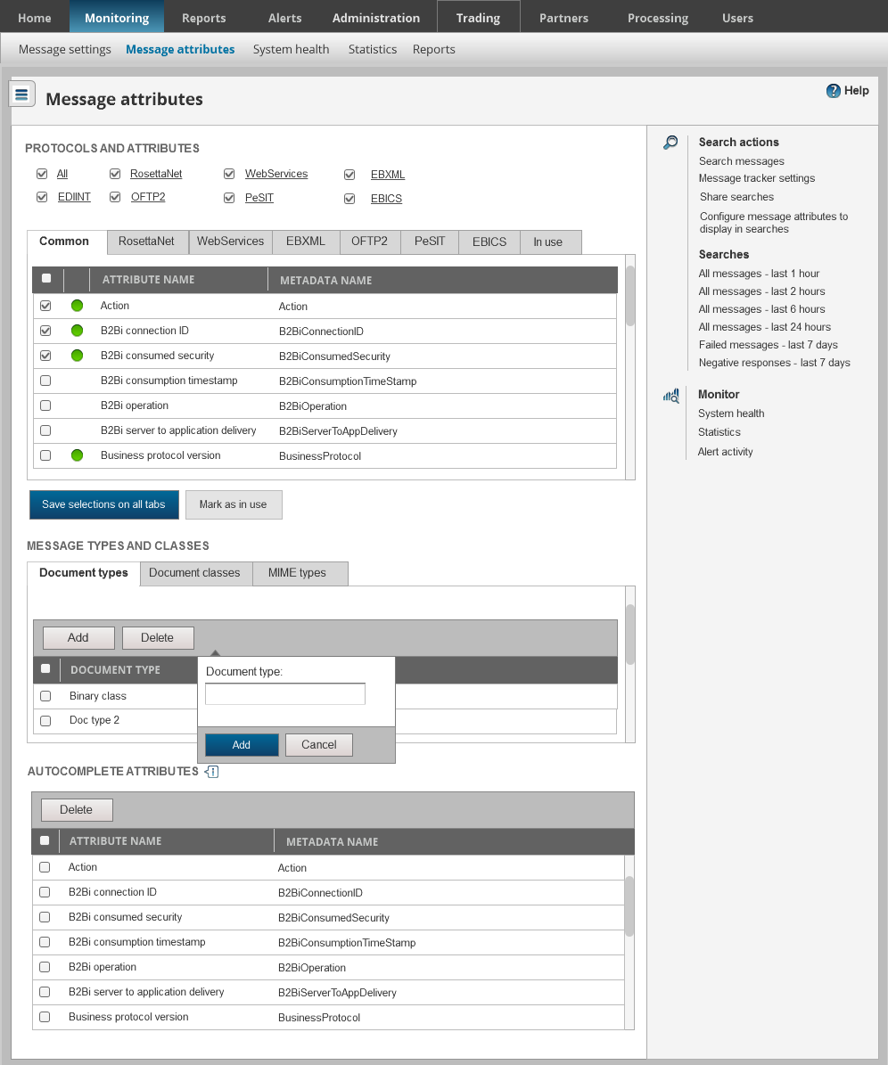
Information architecture
I re-architected the product such that it had a minimal impact on development, moving whole pages instead of breaking them up. This was a design compromise to improve the overall experience.
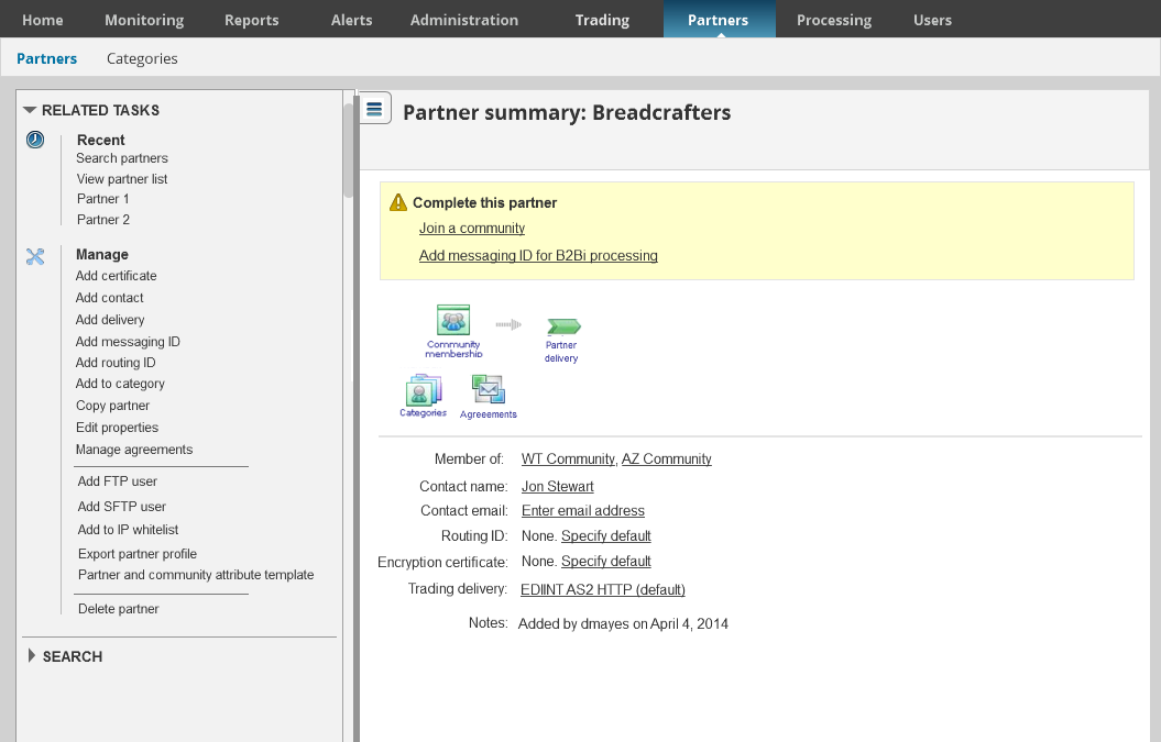
Customer collaborative design for the win!
I initiated a customer collaboration program and discovered some great ways to enhance the product. There was no way to categorize or remove tasks. Customers had hundreds of tasks that they were stuck with. We categorized tasks and added the ability to ignore and remove tasks. We also built a collapsible sidebar for information that needed to be accessed less frequently, while collecting the most relevant actions, recent searches, and other related areas.
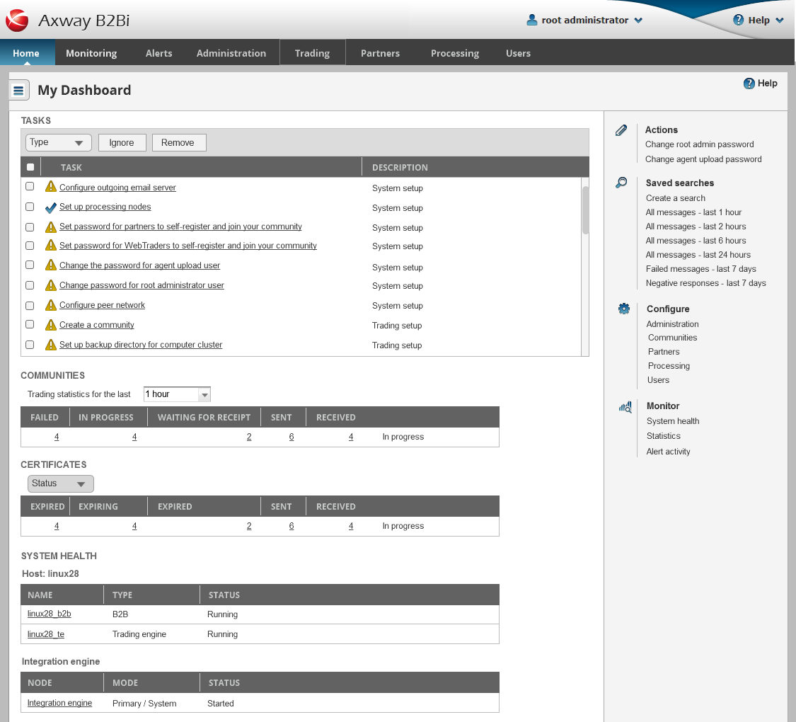
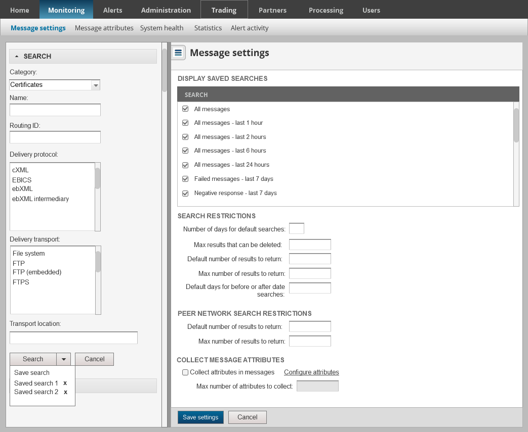
Iterative design
Tried right and left sidebar and even two sidebars. Right sidebar emphasized content, but left sidebar worked best with show/hide menu icon.
Final design
I initiated a customer collaboration program and discovered some great ways to enhance the product. There was no way to categorize or remove tasks. Customers had hundreds of tasks that they were stuck with. We categorized tasks and added the ability to ignore and remove tasks.