Modern and accessible design for IT service management
This took various areas of IT service management, such as change requests, problems, and knowledge management. The clien-based UI was very outdated, caused a lot of cognitive burden and had a high time-on-task. It also was not accessible. The new design reduced time-on-task and met all Section 508 and WCAG guidelines of the time. I created all designs, including iconography. Soon after these new designs were implemented, Cherwell was acquired by a competitor, Ivanti.
Summary
- Use cases: Create and manage problems and their related components, as well as enable problem tracking and analytics.
- Methodologies: Performed competitive analysis, customer research, and process analysis to optimize workflow.
- Objectives: Decrease time-on-task and learning curve with contextual action, system notifications, consistent visual language, simple forms, and more, reducing cognitive burden and uncertainty.
- Requirements: Meet Section 508 and WCAG standards for accessibility
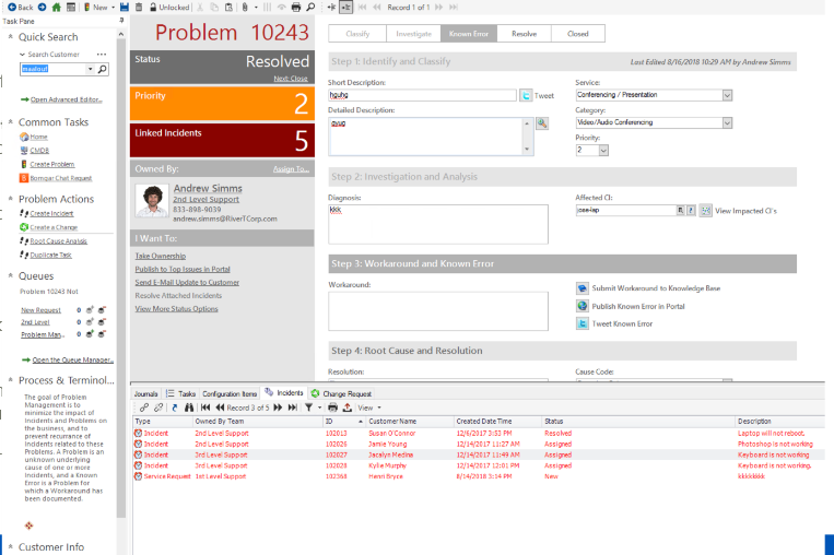
Original design
The old client-based application design created a lot of cognitive burden, including but not limited to:
- This was a client-based applicatio
- Quick search panel that is complex and takes up a lot of real estate
- Overload of colors in the status and linked incidents makes it difficult to understand what to pay attention to.
- Over-abundance of icons that have no labels
- Actions in many places, making it difficult to know what actions are most important
- Red text used everywhere, so everything calls attention, but nothing is salient
- One long form with outdated form design. No help on any form fields.
- No consistent visual language
- Does not indicate required fields, resulting in errors as users try to navigate the complex form
- Very heavy design
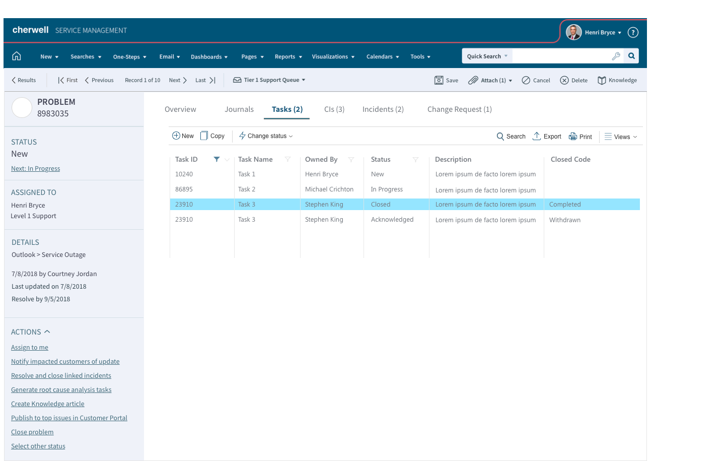
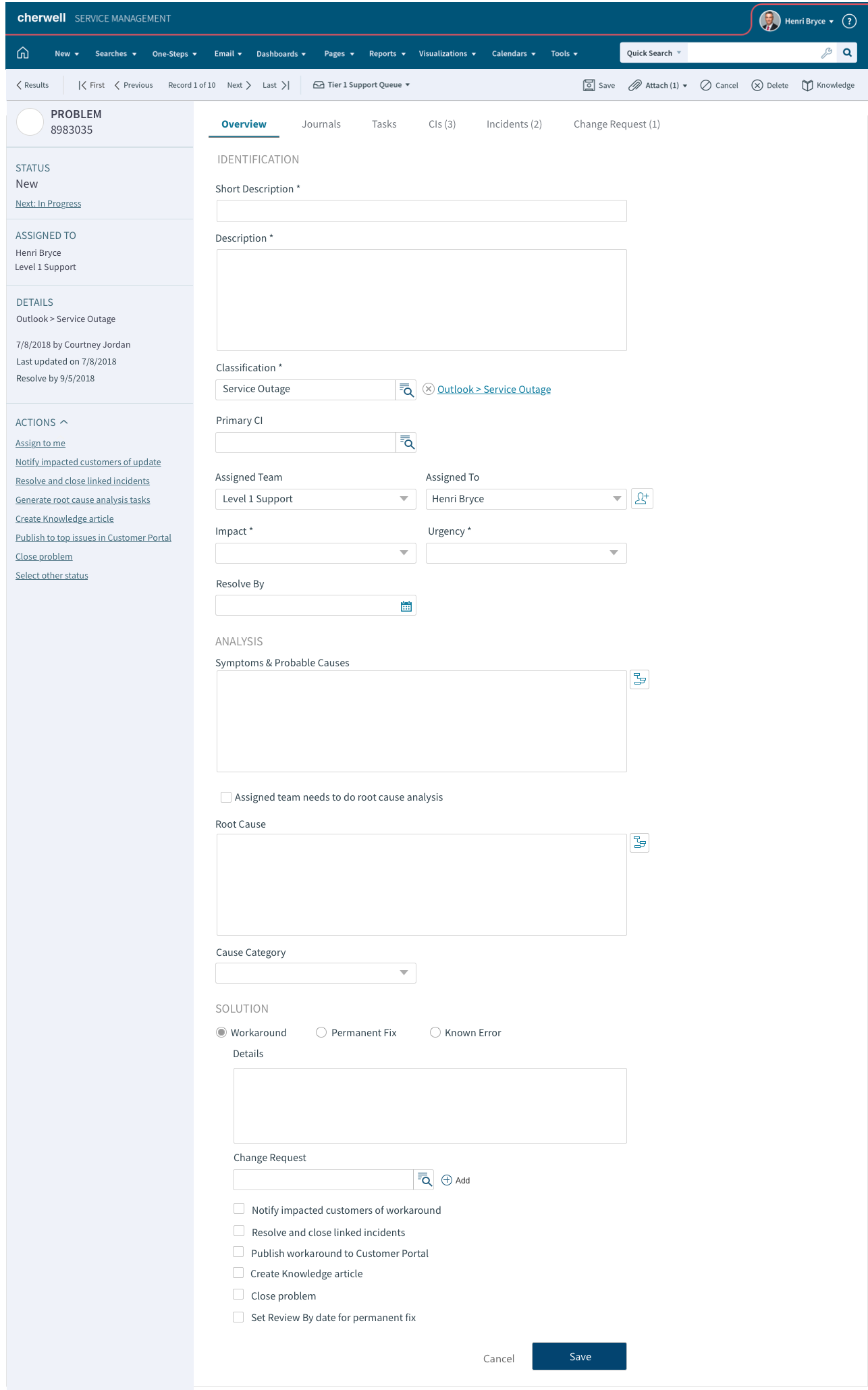
Modern, accessible design
The new web-based SaaS design provides an enjoyable, straight-forward experience, including a list and detail view that provides:
- Task bar for all actions for the form
- Page-specific actios bar with frequent actions to left and less frequent to right
- Tabs
- Clear navigation
- Consistent iconography and clear visual language
- Makes it clear which fields are required
- Sidebar with all relevant information and related actions
- Left-justified form for easy scannability
- Brings forward information such as number in each list
- Clear filtration indicators
- Makes it clear who you are currently logged in as, which is important as support agents often need to log in as customers.
- Accessible layout and background/foreground contrast